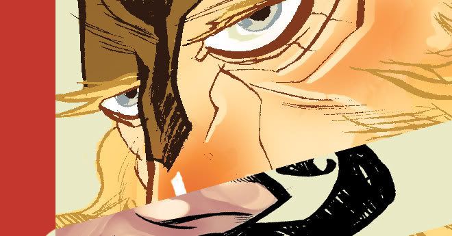
Here's a view at some of my steps in creating a strip of Rick Dangerous. BTW, I'll be putting another one up this Thursday because I won't be in town next week. I'm going to California for the first time to do some traveling. First time I can do that sort of thing. First night there I'll be seeing Hellboy with Guillermo del Toro doing a Q&A and intro.
Okay, so here it goes. My first step is the idea. This week's was Rock N' Roll Rasputin. I've been going through an old sketchbook and bringing back characters that I didn't have the skills to use a few years ago. I created him in like 2004. I have found that skill is a matter of confidence in your own work in a lot of instances. I was doing things that I do now, just without knowing how to repeat it.
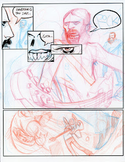
I take the idea, and think of what I want to get done with it, and think of it in the number of panels I want to use. After that I come up with a layout in paint shop pro. Because I like how the boxes look better than photoshop's. From there, I print it onto bristol board. You may think I'm crazy, but I work at 8.5X11 inches. This is work done for free, and I can still hold onto it for selling down the road. The original pages were done at about 5X7 and were in pairs on a page. So moving to 8.5X11 gave me a lot more room to work. My theory is if you deprive yourself of something for long enough (space, time, materials) when you get more freedom, you'll be able to do even better work.
Once the panels are printed out, I technically still don't have a for sure layout of events, but I come up with it as I go. That's how I do my own stuff. This is not how I do work for other people. When given a script I'll actually do 1 inch thumbnails on the script. But Rick Dangerous is a stream of consciousness comic, so the work method has to flow with it.
If I have a gag, or a pun, I have to make sure it flows evenly, and spread the text evenly. I've found a happy medium at this point. Too much text is usually a bad thing for me, but my timing has become much better from paying more attention to Zucker movies, Family Guy, and Venture Brothers. As an artist, it's a great tool to watch lots of movies and well produced television. That way you can learn story structure, action choreography, and I've found that watching (don't laugh) so you think you can dance is amazing on figuring out what kinds of crazy moves a human can actually pull off.
So I write as I draw it in, I think of what works within the panels and try to fill in the pieces. With this one I started out with the largest panel with R&R Rapsutin rocking the guitar. So I needed some way to get to where he was at, so I used the three panels before to lead you around Rasputin and create some dramatic tension. I also used this layout to help keep the eye flowing across the page.
On this page, I tried to clean up my style a little and add some more movement to the characters without actually having them do a lot of jumping. I've been working on those still "talking head" moments. For those of you who aren't artists, or haven't heard the term "talking heads" are, to me, one of the most common things you'll do in comics, but if you make it this way, one of the most boring. I've done a bunch of stories with people in the past where it's TONS of talking. But I've found where you can add in things to make it fun. Play with backgrounds, play with expressions, I mean, Kevin Maguire has made a career out of fantastic talking heads. When I was growing up my brother got me some Justice Leagues from the half-priced bin at a book store, and it changed my world. I love the expressive nature of the faces, going from sad to hillarious. If you haven't looked at his work, they're doing some great reprints of JLI and they're a great price on Amazon. I'm slowly replacing my collection because the old ones smell like a musty sloth.
Sorry for the asides, but that's really how I speak, I get onto tangents quite often. So, we've established the majority of the story. You'll notice I used different colors. I just got in some different col-erase pencils and decided to use different colors for characters and actions. It helped me out logistically. I started with what Rasputin did, then worked on Rick, etc. On the last panel I had to have them facing something and then close out the story. This is the tough part of a Rick Dangerous comic. You are put in the middle of a story, and then you have to end it in around 4 panels. Like I said, put yourself in a tough situation and you can force yourself to do great work. I learned from my very short stint in Comm Design in college that there are ways to combat artist's block, one of those ways is to set guidelines for yourself, make things tougher for yourself. By giving yourself limitations and working under duress, you don't have the option to sweat the little things, you just have to react.
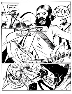
So, in the final panel I went with a fish monster getting blasted by sound. It made sense to me at the time. At first I wanted a giant monkey creature but felt that it wouldn't look as good getting warped by sound waves. A fish can wriggle, so it naturally can bend to warping. I also wanted the rest of the elements of the panel to warp, like the ground where Rick is standing. That creates flow which brings your eye from panel 4 to panel 5. You want the viewers eye to be carried throughout the page. You can do this through where eyes are pointed, the angle an extremity is pointed, what direction a head is positioned, the way the background is placed, everything is important.
Once I get the drawing done, and I leave it pretty loose, I ink. Inking is a place where I am really trying to learn right now. I moved from brush pens to brushes. This one was the first time I used my new Windsor & Newton Series 7 size 2 round brush. I'm using Speedball Super Black ink. I find that it gives you the most working time with your brush before it gunks up. I'll be honest, I'm not working in normal circumstances. I don't have a good inking or drawing table, so I sit in my recliner with a pillow on my lap and a big piece of cardboard my former art dealer sent my art back to me in. So it's not 100% stable. I have had to learn a lot by doing this and balancing the ink on my stomach. I have the bottle inside of an old I Can't Believe It's Not Butter container, so it contains any spill over from shaking. Most people tell you to ink towards yourself, I feel comfortable inking (in clock terms) at a 3 o' clock direction. I get smoother lines that way. It also is important how much ink is loaded whether you are trying to get small lines, or filling in black areas (spotting blacks).
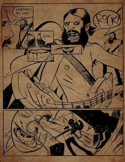
Once I'm done with the inking, I let it dry a while, then I scan it in. I use Photoshop CS2. I scan it in color (CMYK) then I go to the channels and delete all the other colors except black. This leaves me with a clean light gray. I then go to the color mode and change it to grayscale (that's all you'll have available). Then I use Images>Adjustments>Threshold to change the gray lines to black. I usually go to 225 or a little higher. It is best to zoom in really close and do this to see how much you need. Once I'm done, I set it back to CMYK and drop in my background, adjust the paper texture and I'm pretty much done. I save it in layers in case I need to adjust it later (.tiff).
Hope that helps. I'll do more of these when I get time. But hope you enjoy this week's Rick Dangerous.